Been thinking about the interface, I'm getting a bit aware of the different way of design.
Was aiming at making more interactive, or customisable interface, but maybe it's not the right way in this case. (I don't want it to be too gadgety)
The product is a medical device, then it should be 1. Simple, 2. easily fitting to daily routine, 3. sustainable (something you want to keep for long time).
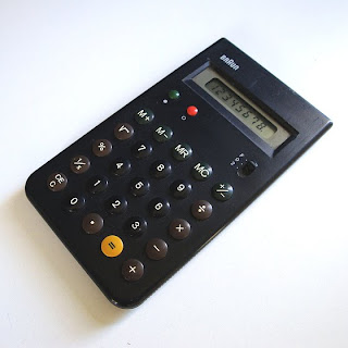
Then I looked up the Dieter Rams again. His design is simple in terms of 1. easy to find how to use, without manual, 2. not too expressive so that the product can fit in daily life.

Fitting in daily like, like melting down into the daily environment. But it doesn't mean it's invisible or not having any effect on life.
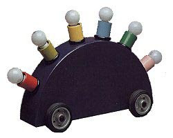
He said 'A little touch of colors is even more colorful than using too much colors'.
Maybe just a little use of colors can make a subtle but positive impact on the environment. Also, the subtle use of colors keeps product simple, which means it's not gonna be eaten away by the surge of fashion.
Since I've been thinking about using colors to bring about positive effect from the product on people, his thought may be helpful.
I also want to take professionals needs into consideration. The current 3 measures (anxiety, depression, optimism) are established measures to rate mood, so it would be better to include these 3 measures to avoid making a mess in the current service system.
That means, we likely have to includes these 3 words,(which I was trying to avoid).
Then I researched about typefaces. Then found some characters of different types.
The type has to be 1.neutral (not expressive) , 2. light, 3. good readibility. I want it to be as ordinary as almost invisible.
Then i decided to use Helvetica Neau-Light. Because Helvetica is most commonly used typeface in our world so that it's supposed to be well melted into our society. In terms of it, it's invisible but still has good readibility.
I'm very aware that the design getting kind of as boring as mundane objects, with normal shape, few colors, helvetica.
But it's the aim. I want it to look as normally as kettles, phones, or so.
Also, we've already got amazing function and cool ID. I don't need to mess around it.

No comments:
Post a Comment